We built the brand around the idea Alice already teaches: simplify, then act. The identity had to feel as clear as her thinking and work as hard as her team.

Alice Benham
Alice Benham: brand identity and templates for a business strategist and speaker
Brand Intensive
Visual Identity
Logo Suite
Social Media Templates
Deck Templates
Stationery + Merch Design
“I’m so proud of my visuals and feel they represent who I am. My community have given great feedback, and I feel more confident when sharing content and delivering talks.”
Alice Benham | Business Strategist
The Brief
Maybe Design Studio is the brand identity studio behind Alice Benham's rebrand. Alice is a business strategist, speaker and podcast host who helps founders cut through complexity, simplify their strategy and take meaningful action. In a brand intensive we designed her new visual identity, logo suite, stationery, merch and a full set of social and deck templates.
Alice Benham is a business strategist with a bold mission: to help founders cut through complexity, simplify their strategy, and take meaningful action.
She came to us ready for a visual reset. Her goal was to create a brand that looked as sharp and considered as her thinking, one that would back her up when pitching to speak at major events, empower her team to create content with ease, and bring consistency across every touchpoint, from Instagram to keynote slides. She didn’t just want new visuals, she wanted a full design system that reflected her clarity, confidence, and creativity.

The Challenge
A visual identity that didn’t reflect her credibility or calibre
While Alice’s business was well-established, her existing branding lacked cohesion and felt out of step with the quality of her work. She wanted a brand that felt intentional, elevated, and trustworthy, something that would immediately communicate the level of strategy and expertise behind the scenes.
A lack of tools and templates to support her growing business
Without clear brand guidelines or reusable assets, Alice and her team were spending too much time reinventing the wheel. She wanted a consistent system that could be rolled out across decks, carousels, lead magnets, and more, saving time and making her content feel cohesive and high-impact.
A disconnect between her external presence and internal clarity
Alice knew exactly what she stood for, but her brand didn’t communicate it. She wanted her visuals to reflect the simplicity, confidence, and personality that were already embedded in her work. Her rebrand needed to feel like a grown-up version of herself: bold but grounded, structured but playful.
The Strategic approach
Alice’s business spans coaching, digital products, speaking, a podcast, stationery and events. Rather than design for each strand separately, we built one system that could carry all of them, with a clear hierarchy so every touchpoint, from a keynote slide to an Instagram carousel, reads instantly as Alice.
We focused on what her audience needed to feel: that she’s credible enough to book for a big stage and approachable enough to buy from. That meant bold but grounded, structured but playful.
The Creative approach
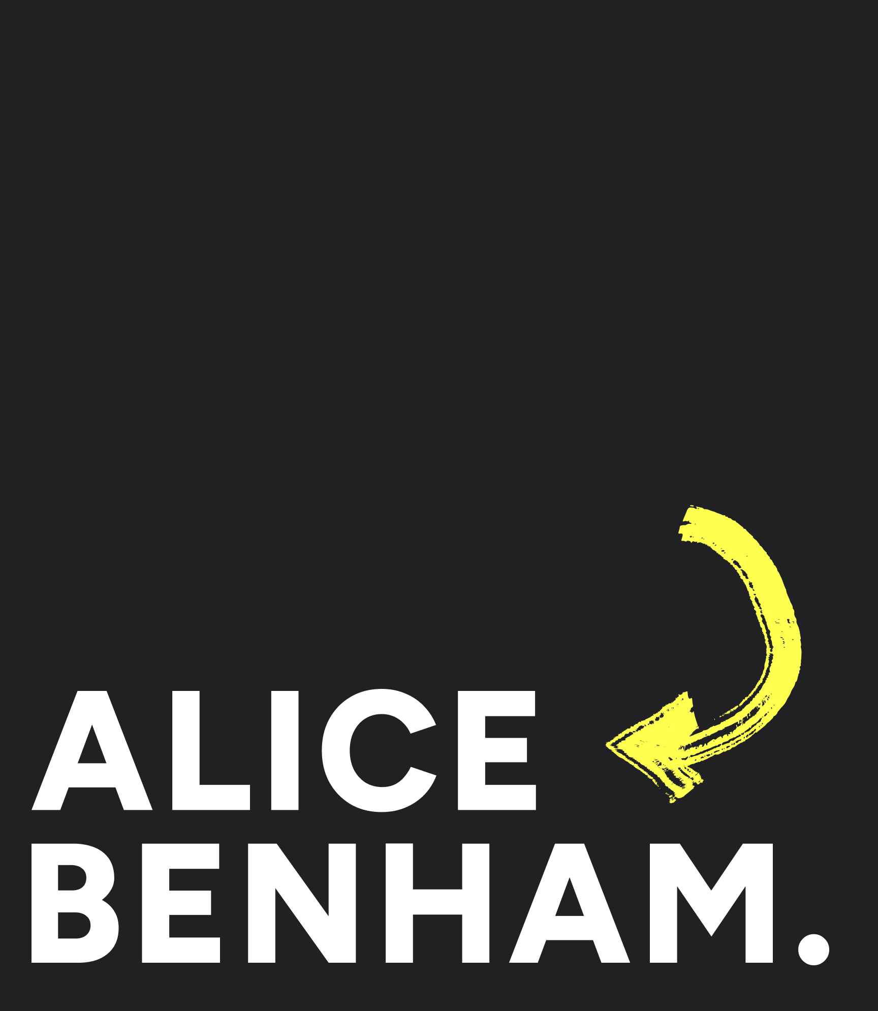
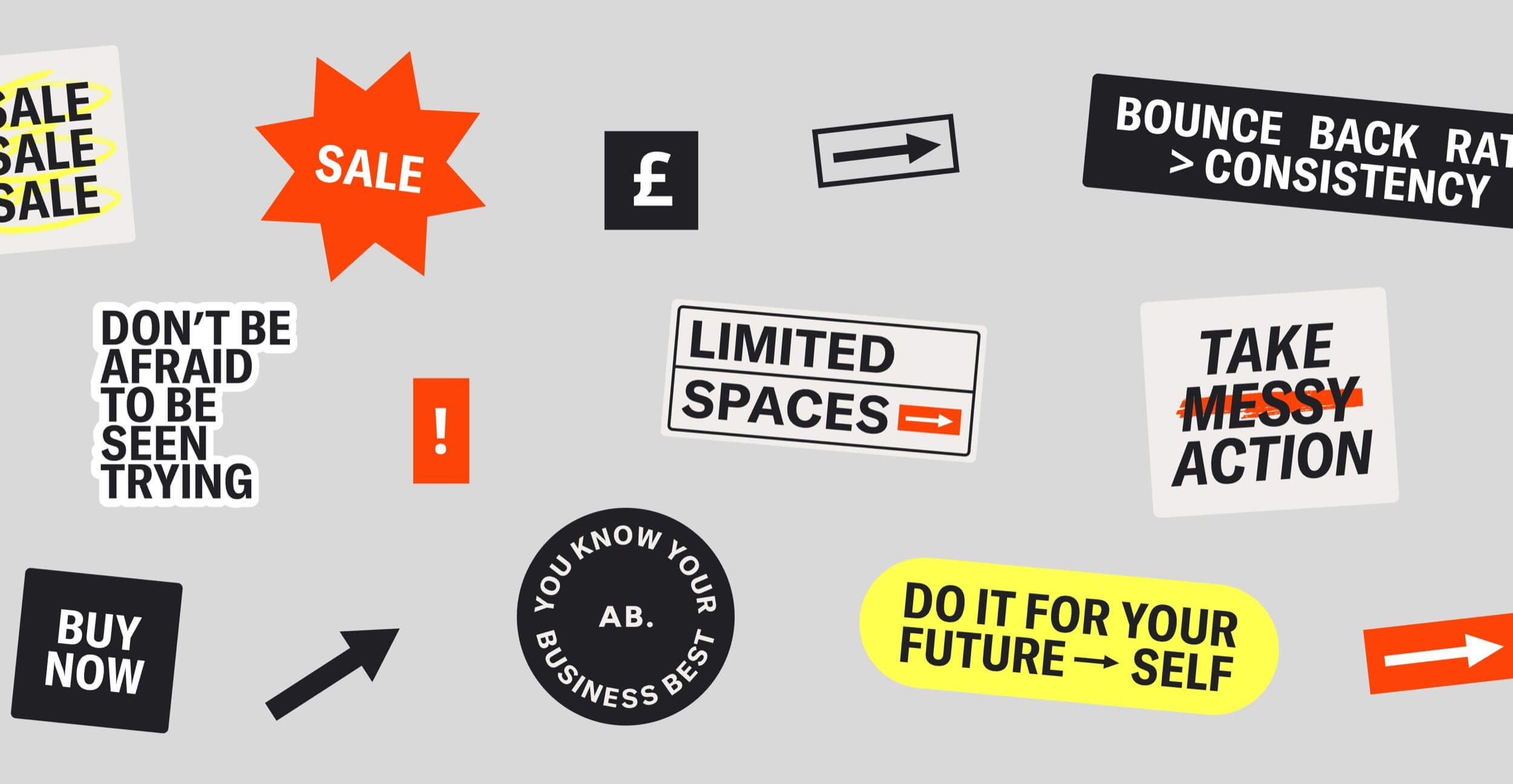
A confident wordmark, a punchy palette of bright white, mid grey, hot red and yellow, and a hand-drawn arrow that adds momentum and a wink of personality.
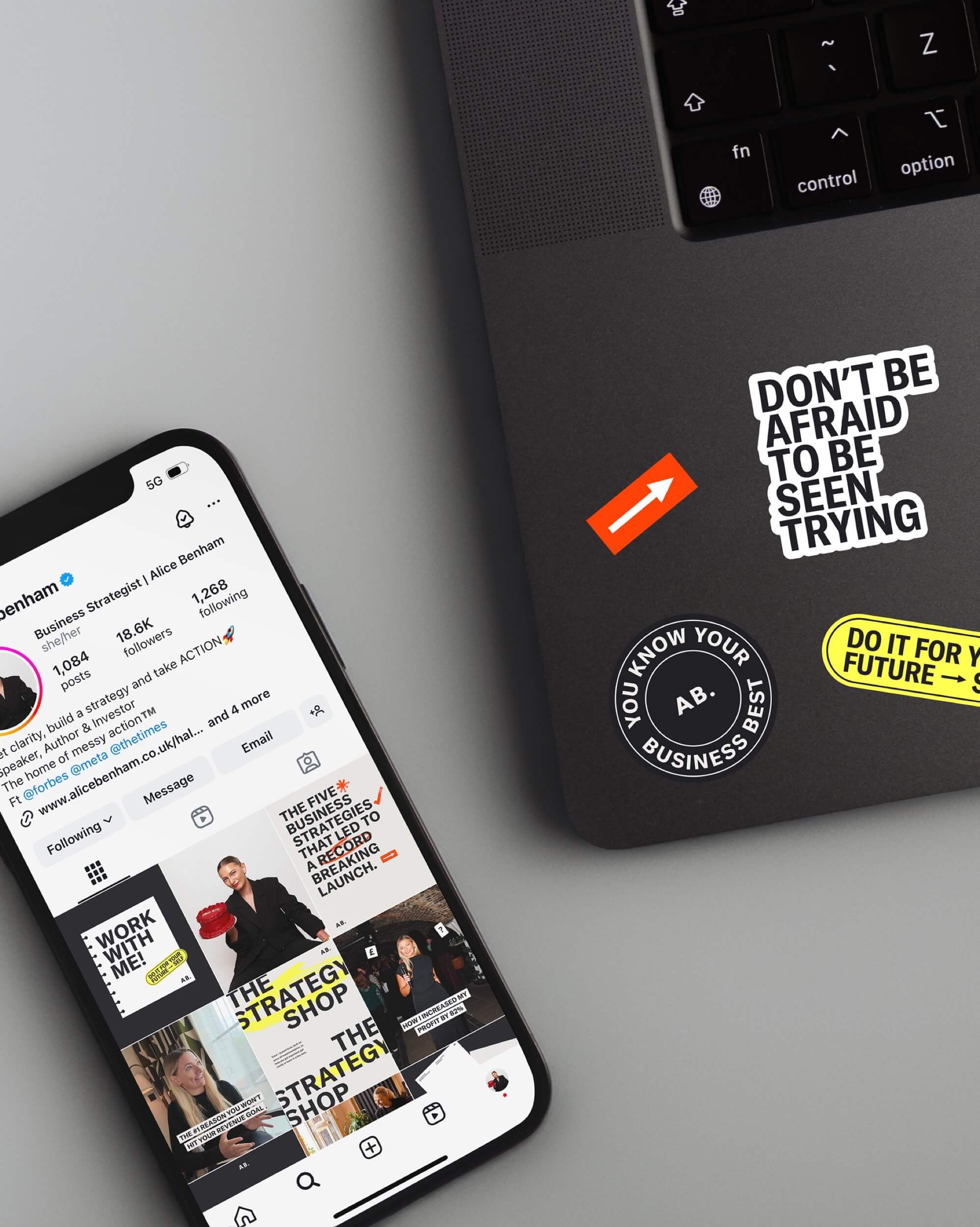
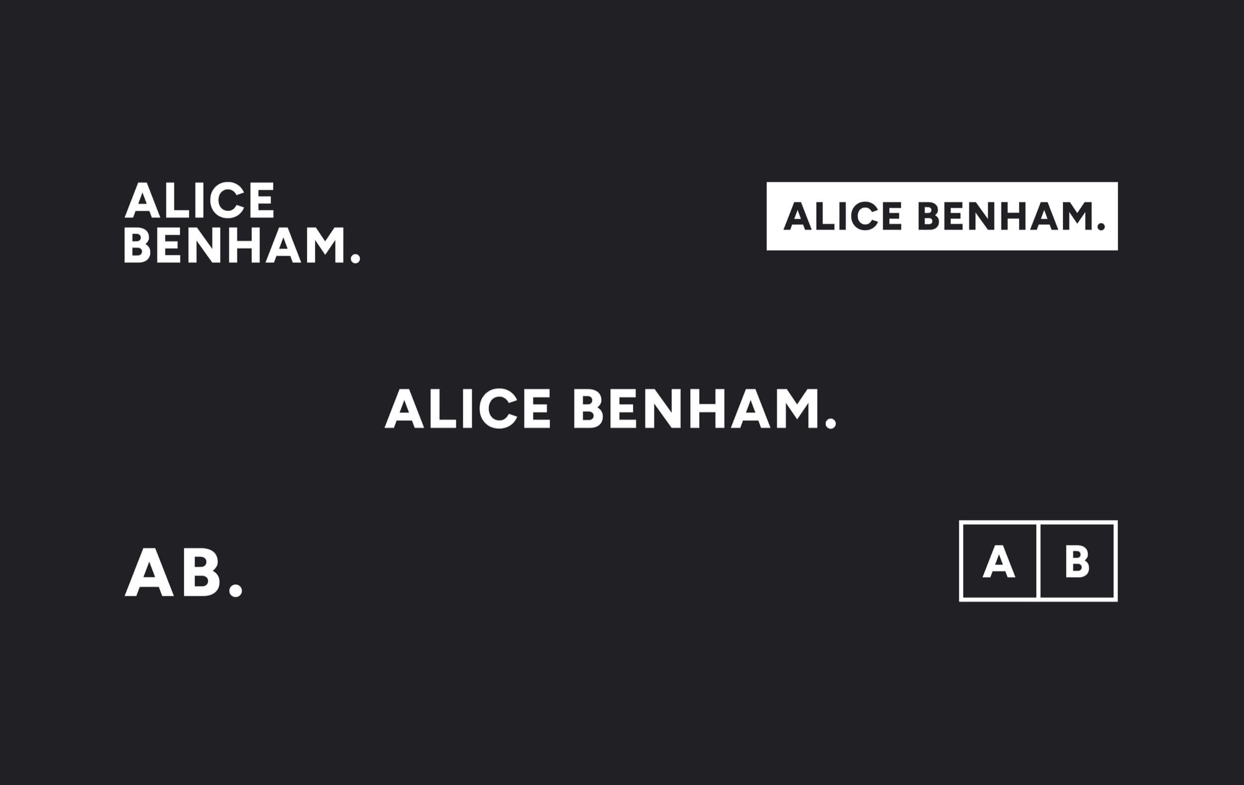
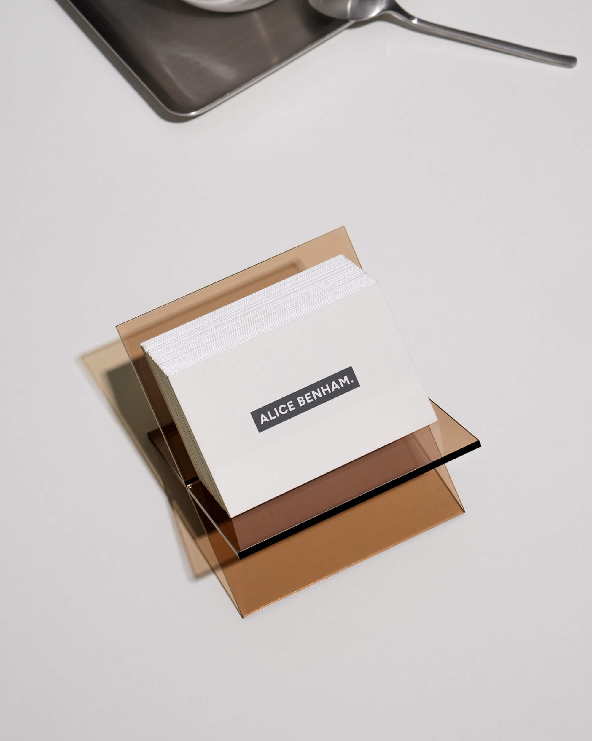
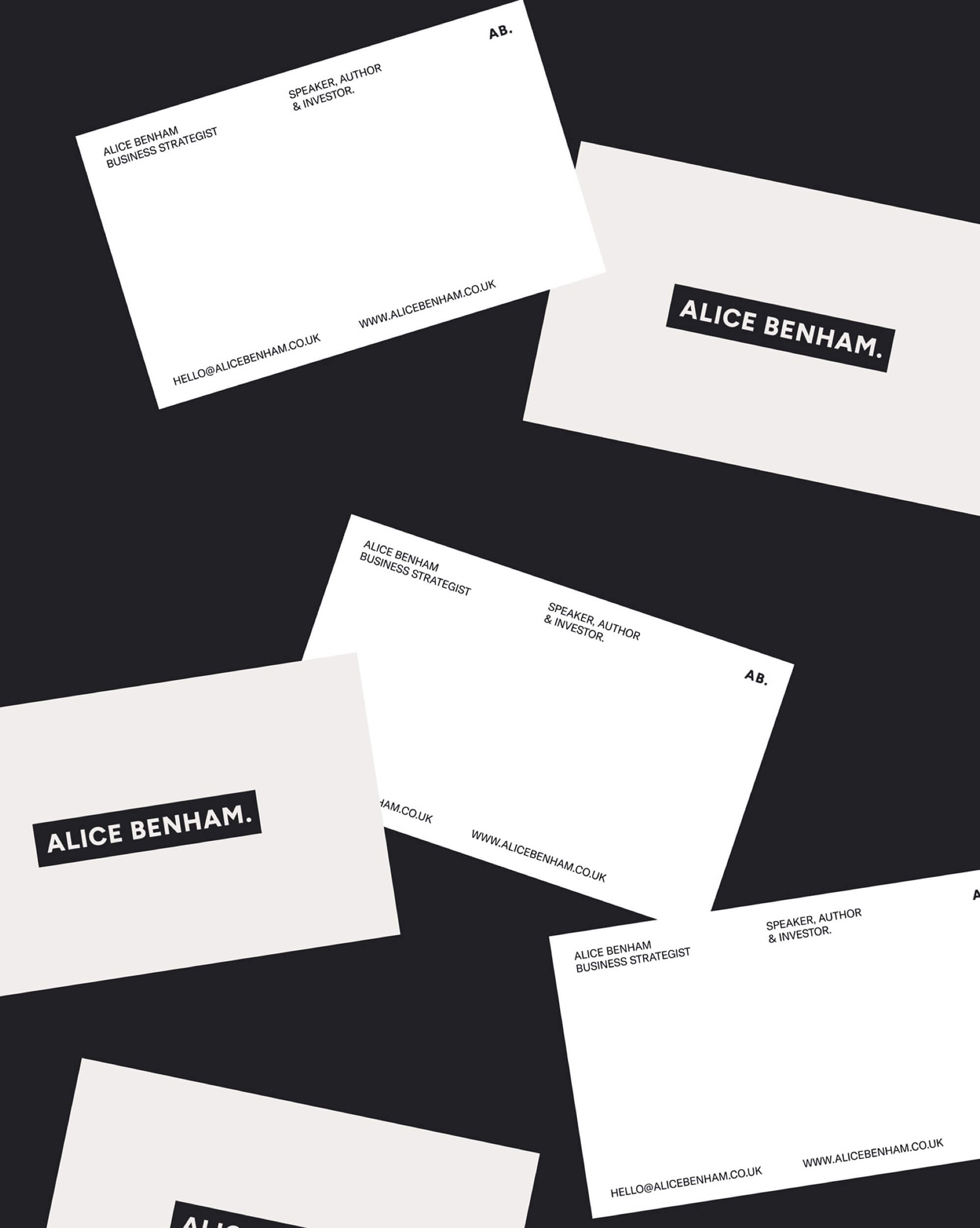
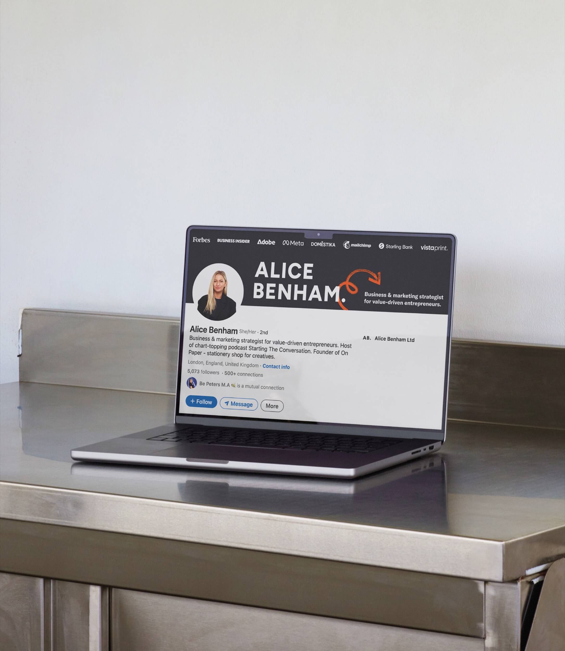
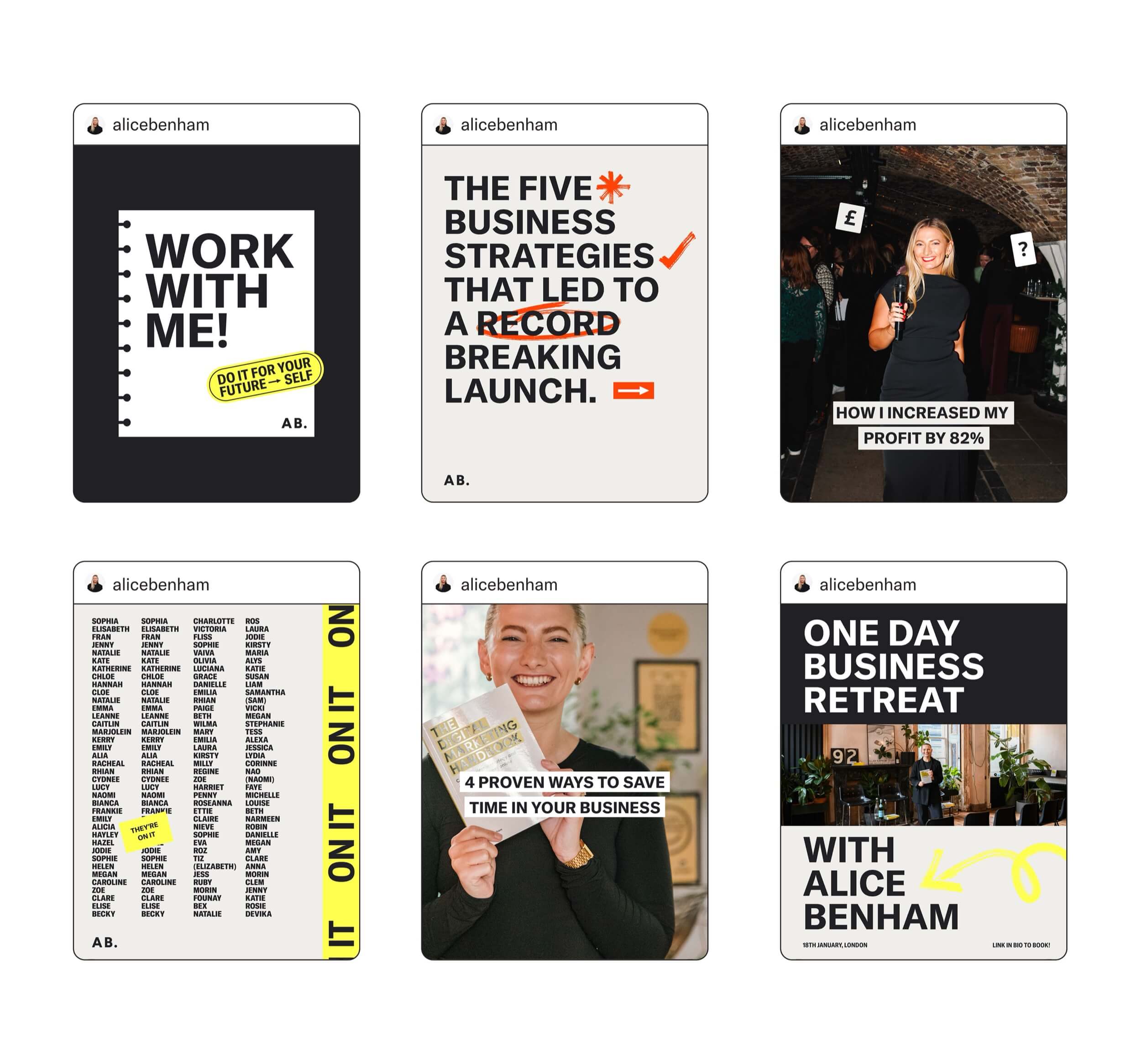
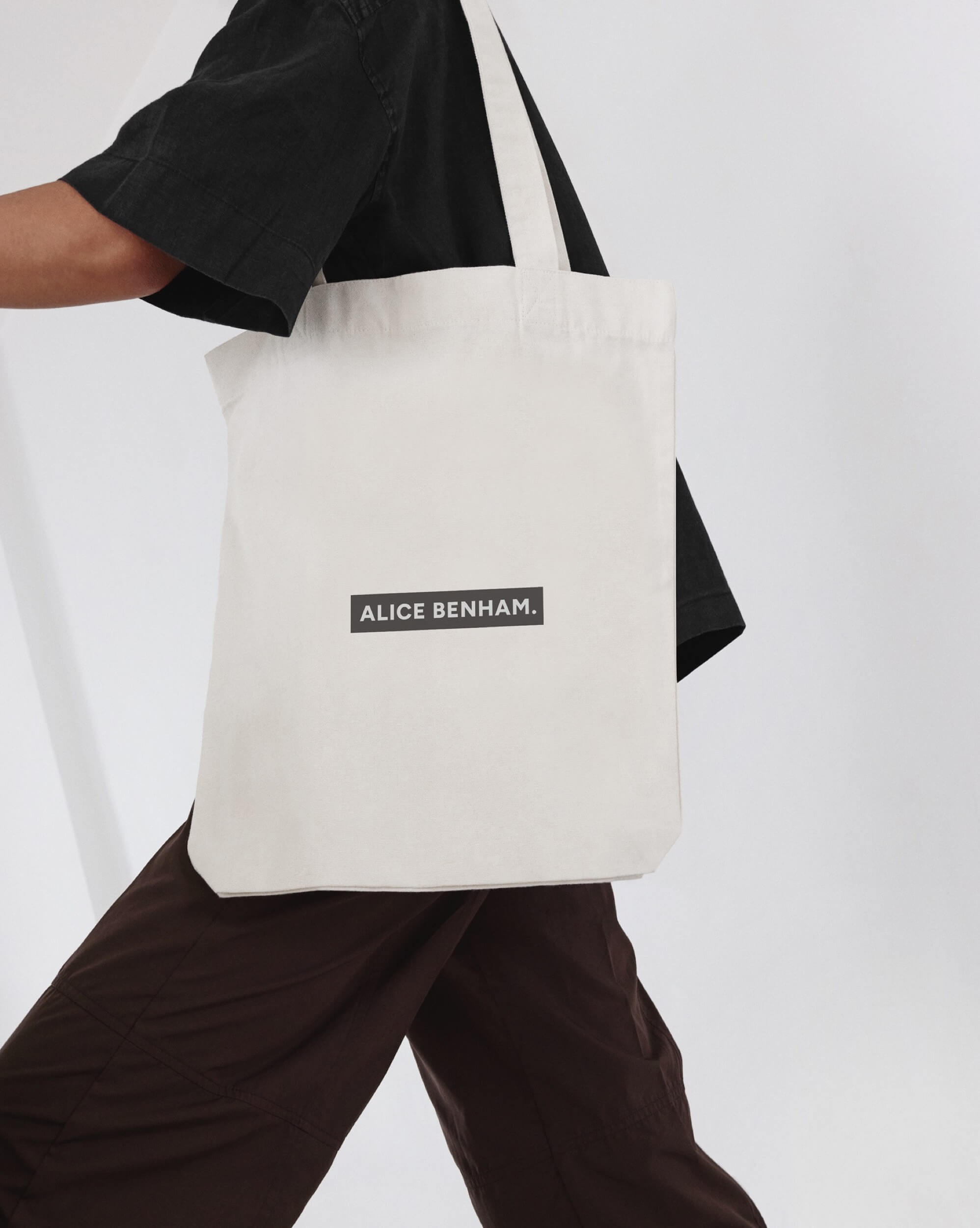
We designed a heavy, confident wordmark with a signature full stop, a stacked logo and an AB monogram, then paired them with clean neutrals and shots of hot red and yellow for energy. Hand-drawn arrows and slogan stickers like “Take messy action” bring her voice into the visuals. The system rolls out across business cards, merch, LinkedIn, lead magnets and a full suite of Instagram and deck templates, so Alice and her team can create on-brand content without starting from scratch.
The Results
A brand that reflects her authority and builds trust
“I’m so proud of my visuals and feel they represent who I am. My community have given great feedback, and I feel more confident when sharing content and delivering talks.”
A streamlined system that saves time and scales effortlessly
“The templates are definitely my favourite outcome. The new visual direction is so aligned, and it’s going to make my life 10x easier having the tools to implement them consistently.”
A renewed sense of creative ownership and brand clarity
“The whole rebrand journey has definitely contained a lot of learnings. It’s made me really question my vision and mission in a good but stretchy way.”

Testimonial
“My branding felt out of date and lacking strategy, and I knew my visuals were letting me down. I wanted something bold and clean, but still full of personality, so I came to Hannah!”
“She understood my vision straight away and helped to shape an external brand which matched the internals, something I hadn't felt for years. Alongside the branding, what's been most valuable is the templates I now have which make it easy to create a cohesive and intentional design across every touch-point. Thank you Hannah and team!”
Alice Benham | Business Strategist