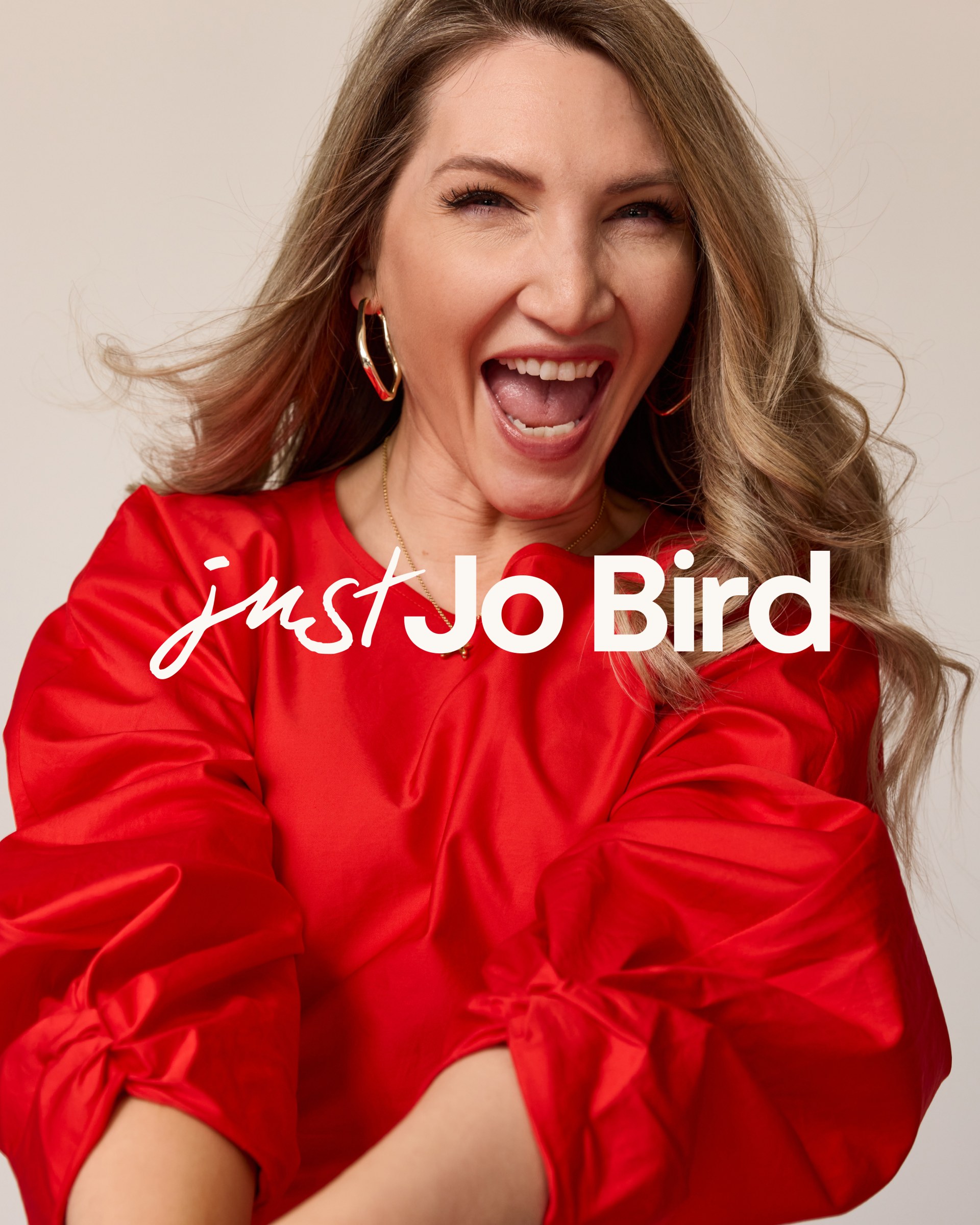
Rather than reinvent Jo, we sharpened what already worked, building the refresh around the red she's remembered for, her natural warmth, and the challenger-brand thinking that sets her apart as a speaker.

Jo Bird
Jodanna Bird: personal brand refresh for creative leadership speaker Jo Bird
Visual Identity
Social Media Design
Deck Design
Website Design
Website Development by Elena Studio
"I feel a lot more confident in my visual presentation than I did before and I'm excited to keep building with it."
Jodanna Bird | Founder, Just Jo Bird
The Brief
Maybe Design Studio is the studio behind the Just Jo Bird personal brand identity for Jodanna Bird, known professionally as Jo Bird. Jodanna led creative at Gymshark and Lounge before becoming a LinkedIn Top Voice, keynote speaker, author of How to Survive Your Quarter-Life Crisis and creative leadership educator. In a one-day brand refresh we designed her visual identity, social and deck templates and website.
Twelve months into freelancing, Jo wanted to evolve from freelancer into a mission-led business that tied her offers together: creative consulting, personal brand coaching, speaking, digital products and LinkedIn partnerships. The ambition had grown. The brand hadn't kept up.
She came to us for a full brand overhaul: a visual facelift and a cohesive system that could carry her energy, sharpen what she stood for, and make her offers easy to navigate. She wanted to keep the red she's recognised for. Everything around it needed a lift.
The Challenge
A visual identity that didn't match the energy she's known for
Jo had built real authority: a Top Voice badge, paid speaking slots, and a track record at two of the UK's sharpest challenger brands. Her brand didn't show it. It felt flat and basic, it didn't say clearly what she did, and it missed the energy people feel when they meet her.
Five income streams, no single thread
Consulting, coaching, speaking, digital products, partnerships. Each pulled in a slightly different direction and diluted her positioning. Jo needed one cohesive system so prospective clients could find their way to the right offer.
A brand built for where she'd been, not where she's going
With a course launch, more high-ticket speaking, and the shift to a mission-led business ahead of her, Jo needed a look that matched her aspiration. She wanted the visuals to finally catch up with the vision.
The Strategic approach
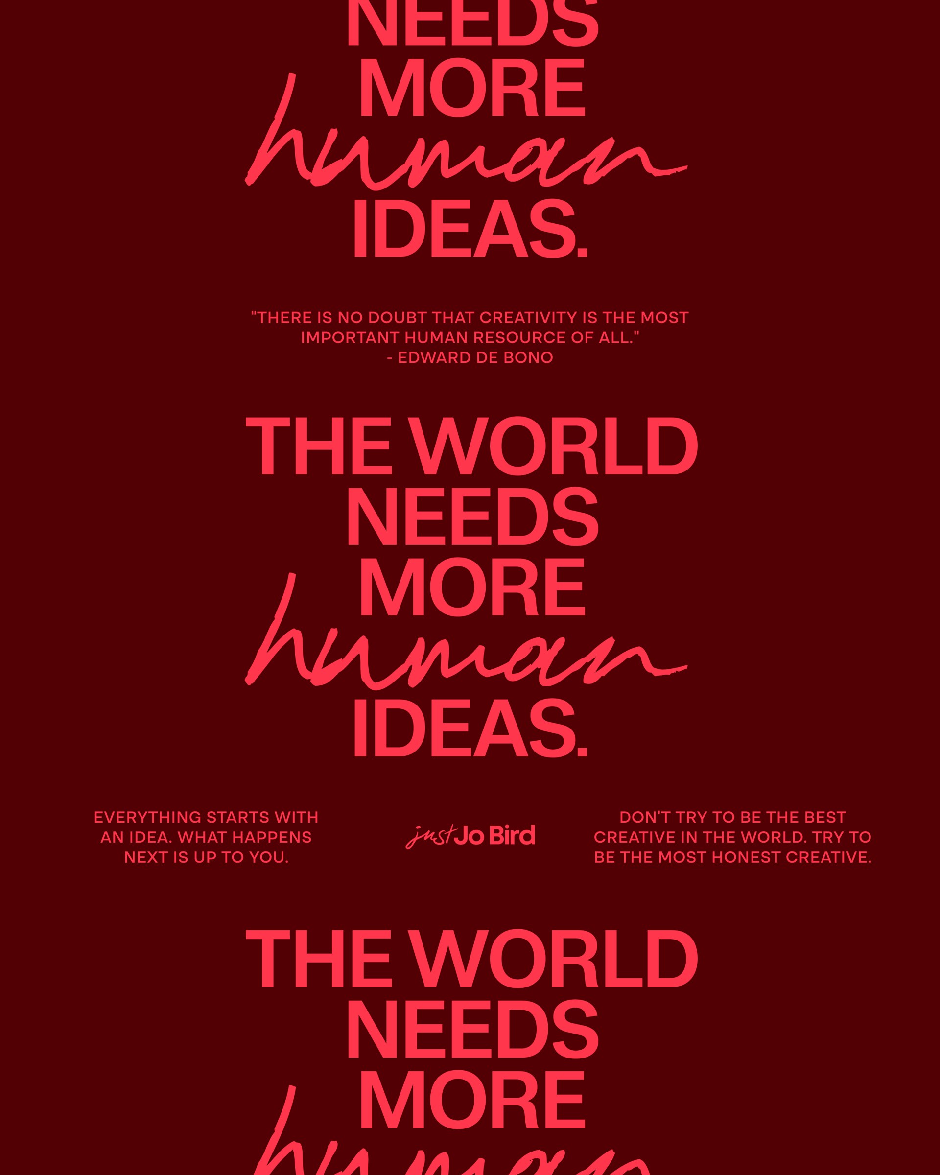
A one-day refresh isn't the place to reinvent someone, so we leaned into Jo's existing strengths rather than overriding them. We focused the brand around her quiet-confidence point of view and gave it room to flex across speaking, coaching and content, so every offer reads as part of the same story.
The Creative approach
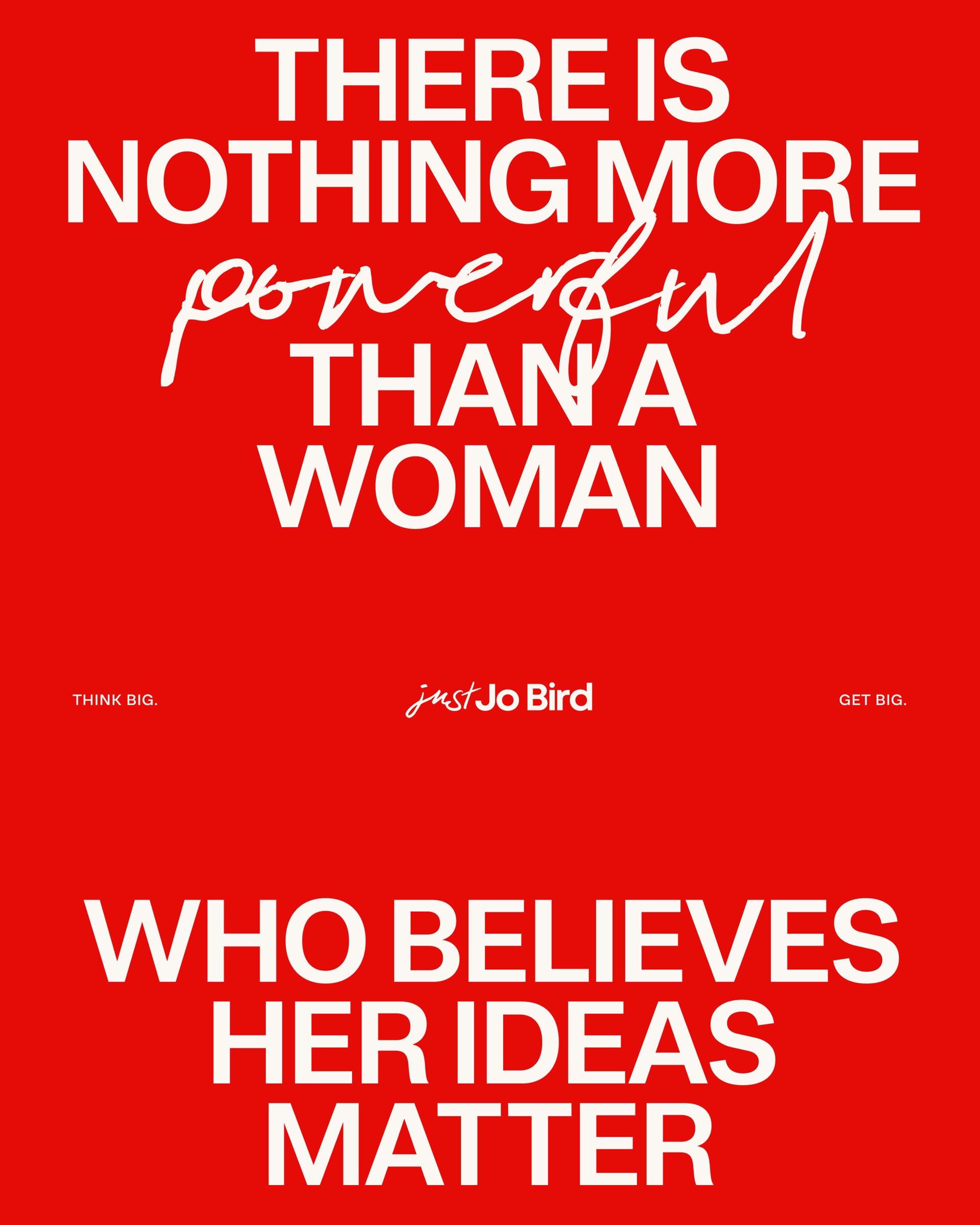
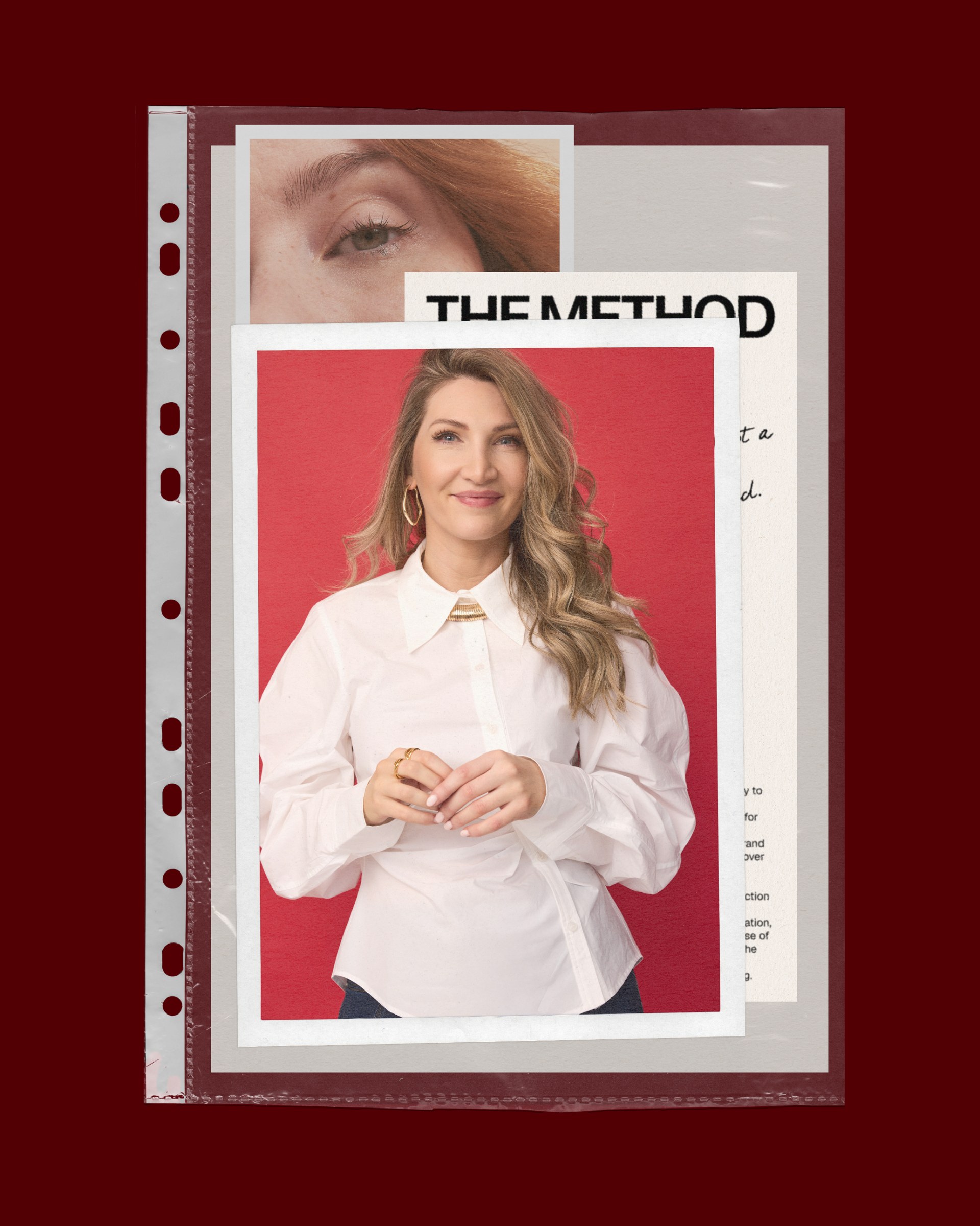
We gave Jo's signature red an editorial, elevated treatment, pairing a curated palette with chunky, confident type and hand-drawn detail, bold and characterful without tipping into 'girl boss' cliché.
We explored the full range of her red and added a considered second tone with more depth, so it never slid into a generic pink-and-red. Editorial layouts, artistic hand-drawn touches and a sense of movement gave it personality, while we steered clear of the swooshy scripts and Canva-template look that flood the female-coach space. The system stretches where she needs it: expressive on decks and social stickers, stripped back and professional on top-level presentations. We handed it over in Figma with templates and tutorials so Jo could run with it straight away.
The Results
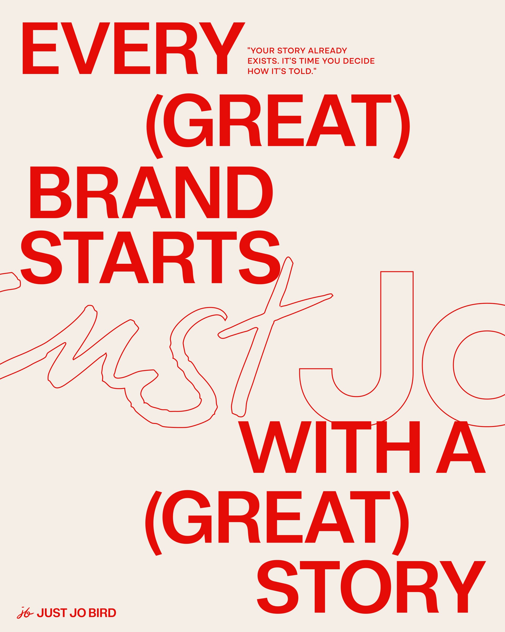
A visual identity that finally matches her energy
I feel a lot more confident in my visual presentation than I did before and I'm excited to keep building with it.
A website she was proud to update, and a more curated feel across her socials
I was able to update my website which had been really bugging me, and feel a lot more confident in the way it's presented. I also like that my IG has more of a curated feel. I have had nice feedback from people in my professional circle.
A system she can actually use
I really liked the Figma with all the instructions and templates. This was so helpful! I liked the launch asset creation, this was a lovely touch.
Testimonial
“I was looking for a creative partner who could hear my ideas and help me sharpen them into an elevated visual identity.”
“I chose Hannah for my brand refresh because I love her design style, personality and ability to assist with strategy. The whole process was extremely thorough and efficient, with my ideas and feedback actioned at each stage. The deliverables were incredibly comprehensive, including asset templates and tutorials. I feel a lot more confident in my visual presentation than I did before and I'm excited to keep building with it.”
Jodanna Bird | Founder, Just Jo Bird